Appendix B Room Designs

The early computer
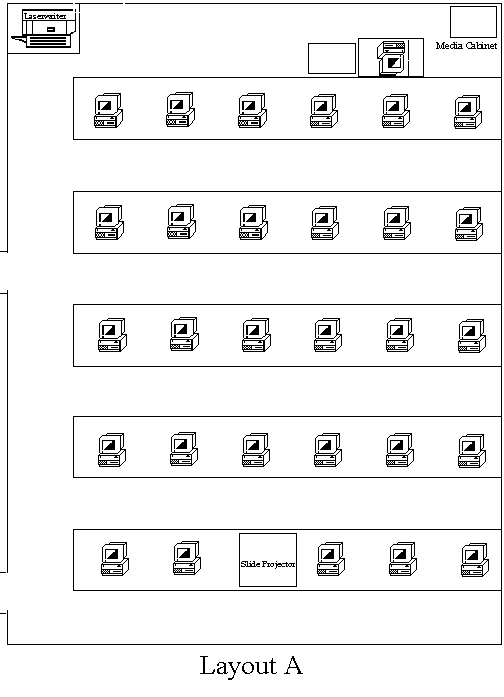
classrooms generally followed the general plan in the Layout A. The instructor
and whiteboard/projection screen are at the front of the room. All the
students face the front of the room. However, many of the instructors teaching
in these rooms wanted to be able to have the students work in collaborative
groups. Some comments included "classroom is an abominable place to
teach composition: five rows of six computers each stretch down a long
narrow room, with the teacher isolated behind a set of tables and a tall
desk, sitting on a high stool. . . . With so many students facing computers,
there is a strong temptation to read-e-mail, surf the Web, or do other
work, and even instructors who are quite successful in other classrooms
have expressed their frustration with this aspect of the room. Making matters
worse, the ranks of tables are narrow and cramped: an instructor who wants
to reach a student near the windows must walk down the aisle and then sidle
in past book-bags and chairs--and even then the quarters are very close."

Therefore, when
the Lab Management group was designing the next computer classrooms we
solicited input from the instructors. The instructors identified several
aspects required:
-
Easy access to the students stations
-
Reduce as much as possible distance from student to instructor.
-
Good sight lines to the projection screen.
-
Ability for students to from groups for collaborative work.
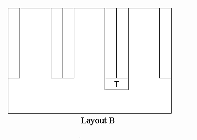
From these concerns we converted the room to Layout B. This layout allows
students to turn their chairs around to form groups. Since the instructor
is closer to the middle of the room (station marked with a T), it is much
easier to see the students and reach them if the student has a question.
Since the student sit back to back the aisles are much wider and less cramped.
The downsides are that some students have to turn around to see the projection
screen (located on the bottom wall behind the instructor.) But some instructors
use a variety of teaching styles, and this layout works well for most.

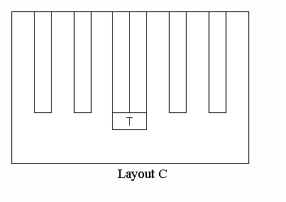
A
third option list shown to the right as Layout C. This is very similar
to Layout B, but all the students are facing towards the center of the
room. This layout keeps the instructor as close as possible to the students.
All the students can see the screen without difficulty and are not too
far from the instructor. However, the aisles are cramped again and it isnt
as easy to do group work. This layout usually works well for sessions where
the instructor is attempting to lead the students through an exercise on
the computers.

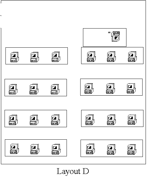
Another option is shown in Layout D. This layout has all the students
facing forward as in Layout A. But since the room isn't as long and the
door location allows us to use a center aisle, the instructor still has
reasonable access to the students. This demonstrates the importance on
room dimensions for the layout. While the Layout A didnt work, Layout
D in different sized room works well. This rooms is good for leading students
through an exercise, so it is used extensively by Design classes to instruct
students in the use of multimedia applications.
In conclusion, there are two issues you must keep in mind while designing
the layout of a computer classroom: the teaching style of the instructors
who will be using it and the dimensions of the space. Once you have these
issues clarified you will be able to design the best possible computer
classroom.
